
Hack Oregon : Case Study
Hack Oregon is a community-powered nonprofit committed to promoting greater civic awareness and engagement through data-inspired projects
Sector
Community-powered nonprofit
Challenge
The goal is to increase user engagement with the website, while also increasing the users comprehension throughout the following processes: registration, product discovery and execution signing up to participate in Hack Oregon Classes..
My Role
Visual Designer, UX Design
Project Time
3 Months (before handoff to development)

The Problem :
The goal is to increase user engagement with the website, while also increasing the users comprehension throughout the following processes: registration, product discovery and execution signing up to participate in Hack Oregon Classes.

Discovery Through Research :
Every solution begins with the discovery of the problem. We began by asking questions, What is Hack Oregon trying to bring forth for its users? Why should users use Hack Oregon? What sets them apart from their competitors? In, order to find where the problem lies, we conducted usability testing on the existing website to observe and pinpoint pain points, preferences, wants and needs while navigating through the website.

Research Ideology:
To redesign Hack Oregon website in order for the links, the site to be able to be able to viewed easily by the public looking to attend Hack University and also for the those who are interested in finding more about who Hack Oregon is. Testing the original design and making lists of what works and doesn't.

Competitive Analysis :
Looking at a few brands out in the market, we compared their websites' functions and brand against Hack Oregon following some guidelines- focusing mostly on findable, accessibility, communication, and sustainability in a growing market of
courses in Tech. We found that Hack Oregon proves to effectively attracts and maintains their users. Both their UI and user flows serves as case studies for their applications and website experience

Defining the Problem:
From our user research and usability testing with students and other people who want to get tech training. We identified four areas where the users were having the most difficulty.
*
Navigating the website.
The layout is confusing.
The information about signing up is hard to find.
The fonts are super large on the website and overwhelming.

User Journey Map:
The user journey map allowed us to identify the problem areas.Where we focused our solutions around four elements of the Hack Oregon website.

Personas:
With the synthesized data,
Each persona had varying needs for resources, preferences when learning about this product
it was clear that Hack Oregon would have many types of users that would best represent the user base: examples would be :
Student
Career Changer,
Worker wanting to learn more for their job.
Design Process:
I mapped out roughly three hours to sketch ideasFocusing on their objective of their needs and audience, I concluded that that if they simplified on what they do: classes, dates, and more information about Hack.orgOnce I had my wireframe sketches completed, I immediately took my ideas into Photoshop, Illustrator and Sketch to create all the creative templates.

Final Prototypes
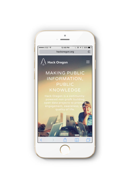
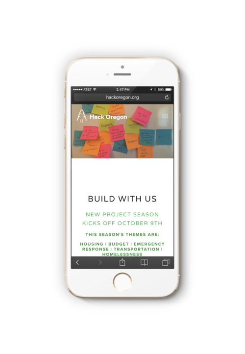

Final Redesign that has been applied to their mobile site for http://www.hackoregon.org